
Just like many other writing systems, the Tengwar allows for many different calligraphic styles in writing. In fact, the Tengwar is unusually well suited for calligraphic freedom, since most characters consist of only two variable elements — a stem and a bow. As long as these two identifiers can be recognized, the writer can use any calligraphic style imaginable. In the works of J.R.R. Tolkien, a few distinct styles can be discerned. These are presented here.
The basic principles for Tengwar calligraphy are the same as those for Roman-alphabet calligraphy. If you want to learn more about calligraphy there is a wealth of good books on the market. Here it will be sufficient to summarize the basics:
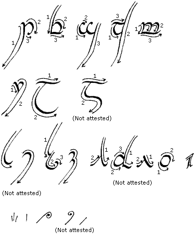
In the tables below, the numbered arrows show the order and direction in which to draw the lines of the tengwar.
The Tengwar table in AppE is said to show the tengwar “in formal book-hand shape”. This is by far the most common calligraphic style. Samples abound: The Tengwar Table, Namárië, The Brogan Tengwa-greetings, So Lúthien etc.
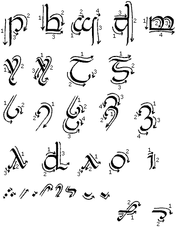
 The style is strongly reminiscent of the medieval half-uncial,
the writing used in works such as The Book of Kells.
The pen angle is roughly
45°.
The serifs, the ends of the stems, can be decorated in a number
of ways.
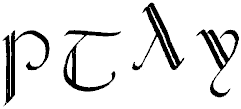
Sometimes names are in writing emphasized with a larger initial tengwa. Further emphasis can be added by doubling the stem of the tengwa.
This style is a variant of the formal book-hand in which the bows are not curved but drawn in straight angles, causing “points” to appear where the line changes direction. In Pictures #48, Christopher Tolkien refers to this style as “the ‘pointed’ style”, though it is unclear wether this is a term J.R.R. Tolkien himself made use of. The style appears in Elvish Script Sample I and II, Namárië, and the King’s Letter, first version. The pen angle is roughly 45°.
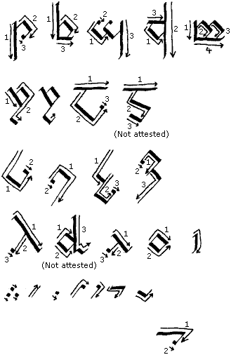
In Namárië, the headline of the text is written in the pointed style with doubled stems, but the text itself is written with the formal book-hand. Likewise, in the King’s Letter, first version, the pointed style is used for strong emphasis in a text otherwise written in the book-hand.

This fine, “flowing script” appears in The Ring-inscription. The style is an almost cursive version of the formal book-hand, slightly reminiscent of the Italian Cancellaresca style. It is here written with a calligraphy pen, but it might also be written with a nib — and for the tehtar this is preferable. If you use a calligraphy pen, the pen angle should be 45° or slightly steeper.

![]() The lambe can be connected to a following tengwa
by a curly line.
The curly tehtar (and presumably the accent, though
that is not attested) are connected to the tengwa below them.
The lambe can be connected to a following tengwa
by a curly line.
The curly tehtar (and presumably the accent, though
that is not attested) are connected to the tengwa below them.
This style appears on The Return of the
King Jacket (draft). The lines are firmly horizontal
and vertical, which makes the style rather tiresome to write with a pen.
The style is probably in origin not a calligraphic
style at all, but rather one used for inscriptions in stone or similar.
 The pen can be held in an angle from 45° to roughly 0° which will
make the horizontal lines thinner than the vertical ones.
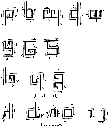
There are tehtar in the sample inscription, but they are too faint to make out with any certainity.
This style is seen in Elvish Script Sample III. In Pictures #48, Christopher Tolkien calls this style “decorated verse-hand”, though it is unclear if the Author himself used this terminology. Calligraphically speaking, this style is simply a decorated version of the formal book-hand written with a nib, and is therefore not discussed further here.
These are the calligraphic styles that we know Tolkien made use of. But of course there is nothing that prevents you from inventing totally new styles. It should not be forgotten, that the art of calligraphy is first and foremost about being creative with letters!